Your App Store screenshots are the single most important visual asset in your app's conversion funnel. In the seven seconds a potential user spends deciding whether to download, your screenshots do the heavy lifting — communicating value, building trust, and differentiating your app from hundreds of competitors.
This guide covers everything you need to know: from foundational design principles to high-converting templates, platform-specific requirements, AI-powered localization workflows, and measurable optimization strategies. Whether you're launching your first app or optimizing an existing listing, these principles apply directly to your next screenshot set.
Why Screenshots Are Critical for ASO
App Store Optimization isn't just keywords and ratings. Your screenshots are front-and-center real estate that directly impacts conversion rate. Studies consistently show that:
- Users spend an average of 7 seconds on a store listing before deciding
- Visuals are processed 60,000x faster than text
- Apps with optimized screenshots see up to 28% higher conversion rates
- The first two screenshots account for over 70% of user attention in search results
The screenshots communicate three things instantly: what your app does, why it's trustworthy, and why it's better than alternatives. A weak first screenshot doesn't just fail to convert — it actively pushes users toward a competitor.
Platform Requirements Overview
Before designing, you need to understand the technical constraints. Here's a quick reference for the major platforms:
| Platform | Screenshots | Resolution Requirements | Text Rules |
|---|---|---|---|
| iOS App Store | 3–10 per localization | 6.9" (1320×2868), 6.5" (1242×2688), 5.5" (1242×2208) | No device frames required |
| Google Play | 2–8 per locale | 16:9 (1920×1080), 9:16 (1080×1920), 2:3 (1080×1620) | Device frames allowed |
| iPad | 3–10 | 13" (2064×2752), 11" (1668×2388) | Same rules as iPhone |
| macOS App Store | 1–10 | 16:10 (2880×1800), 16:9 (2560×1440) | Separate set from iOS |
Always upload the highest resolution available — Apple and Google automatically downscale for smaller devices. Submitting low-resolution screenshots is one of the most common and costly mistakes developers make.
iOS App Store Screenshot Sizes (2025)
Apple requires you to submit screenshots for specific device sizes. The most important are:
- 6.9-inch (iPhone 16 Pro Max): 1320×2868 px — required for newer listings
- 6.5-inch (iPhone 14 Plus, 15 Plus): 1242×2688 px
- 5.5-inch (iPhone 8 Plus): 1242×2208 px — still required for backward compatibility
If you submit a 6.9-inch set, Apple will use it for all smaller iPhones automatically. However, you'll still need a separate iPad set if you want your app featured on iPad.
Google Play Screenshot Requirements
Google Play is more flexible but rewards quality. Key rules:
- Minimum 2 screenshots required; 8 maximum
- JPEG or PNG, maximum 8 MB per image
- Minimum dimension: 320 px on the short side
- Screenshots appear in a horizontal scroll in search results — the first frame is your hook
The 10 Templates That Actually Convert
Not all screenshot layouts are created equal. After analyzing hundreds of top-performing apps, these ten templates consistently drive the highest conversion rates.
1. The Problem-Solution Frame
Show the user's pain point on the left, your app's solution on the right. This mirrors the user's internal dialogue and creates instant relevance. The contrast between "before" and "after" is one of the oldest conversion techniques in marketing — and it works just as well in the App Store.
Best for: Productivity, utility, health, and finance apps.
2. The Feature Carousel
Each screenshot highlights one core feature with a bold headline and clean device mockup. Keep text under six words per frame. The feature carousel works because it respects the user's attention — they don't have to read everything to understand what your app does.
Best for: Apps with three to five distinct features.

Example: a minimal, colorful feature carousel template showing multiple app screens in a clean grid layout. Use this template →
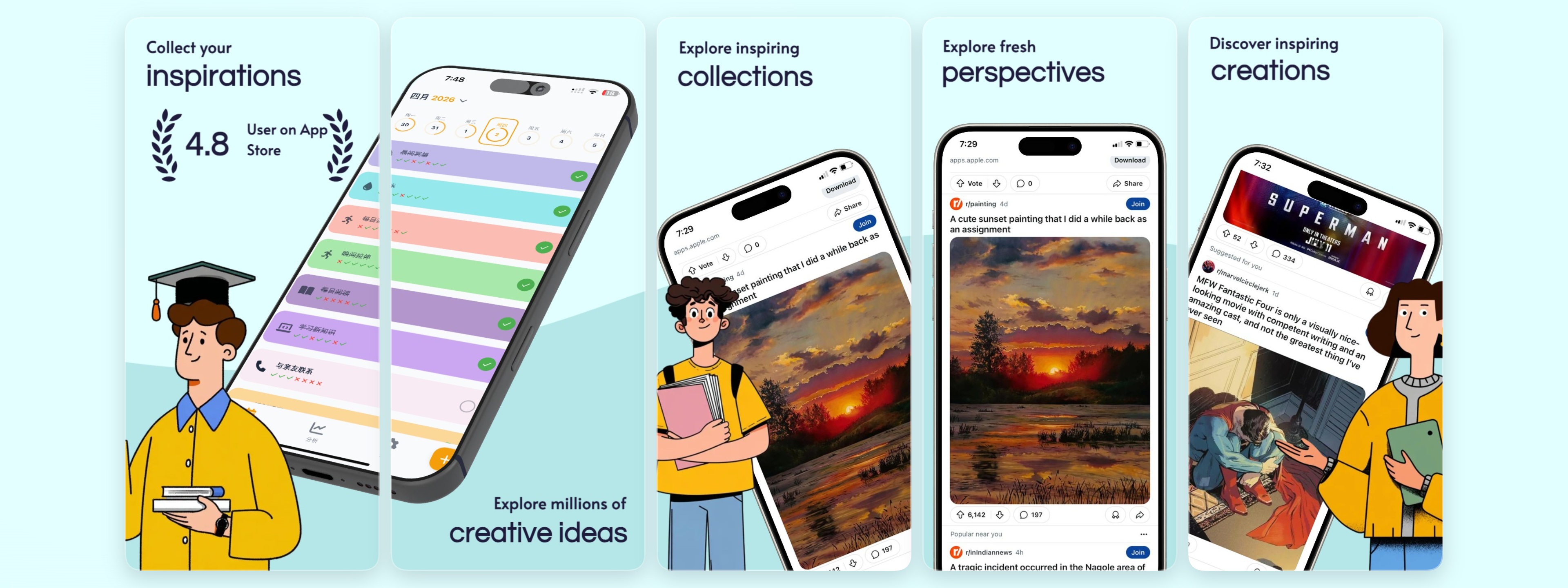
3. The Social Proof Shot
Lead with ratings, testimonials, or user counts. Social proof reduces perceived risk and builds instant trust. A single screenshot showing "4.9 stars · 50,000 ratings" can be more convincing than five screenshots of your UI.
Best for: New apps building credibility, apps in competitive categories.
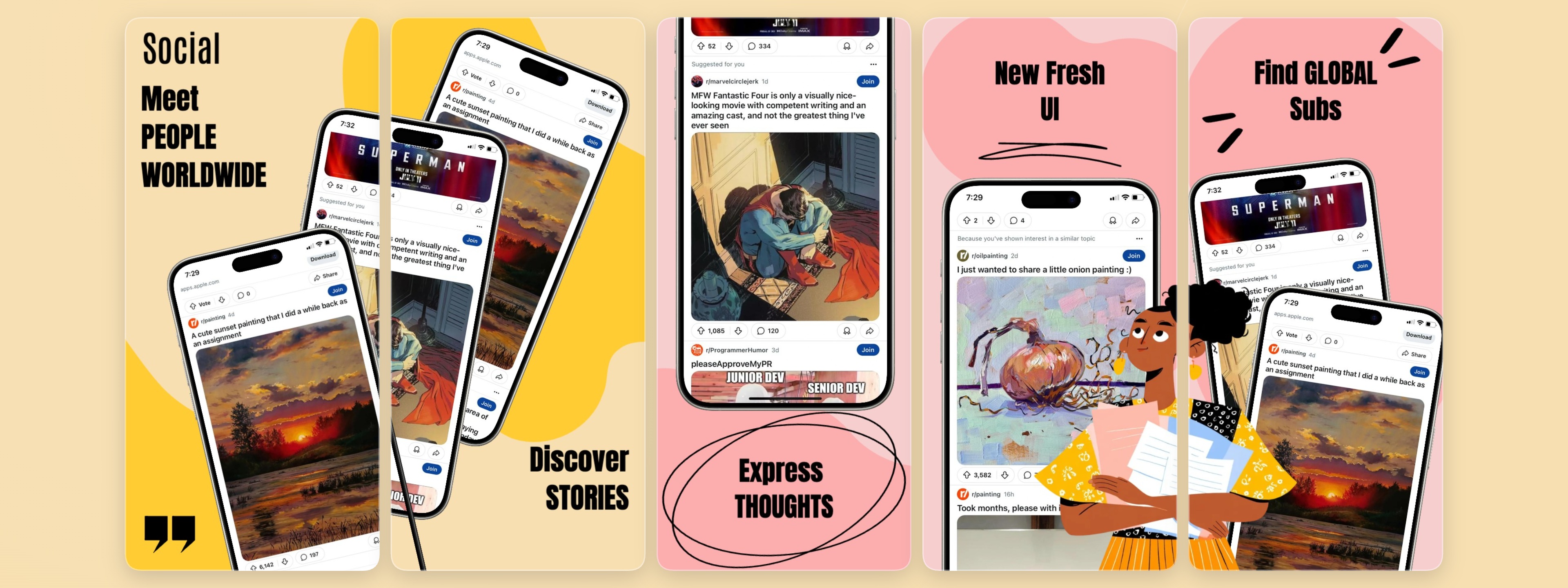
Example: a social media app template using bold typography and community metrics as conversion anchors. Use this template →
4. The Before/After Split
A dramatic visual comparison showing life without your app versus life with it. Use contrasting colors to emphasize transformation. This template works exceptionally well when the "after" state is visually striking — a clean budget dashboard, a transformed photo, a completed workout streak.
Best for: Photo editing, fitness, finance, and design apps.
5. The Stats & Numbers Frame
Lead with a big number: "Save 5 hours a week," "Join 2M+ users," "99% satisfaction rate." Numbers catch the eye and create urgency. Use them prominently in your first or second screenshot.
Best for: Productivity, finance, and B2B apps.
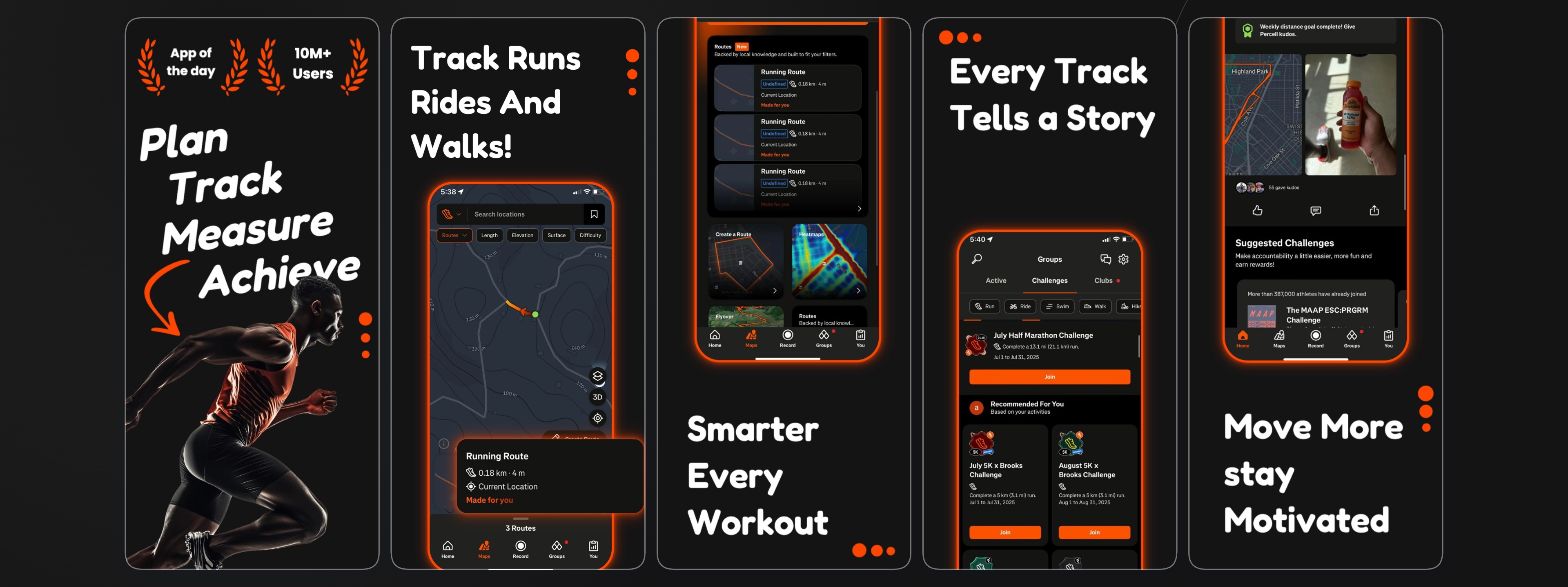
Example: a fitness app template using bold stats, progress metrics, and high-contrast layout to drive conversions. Use this template →
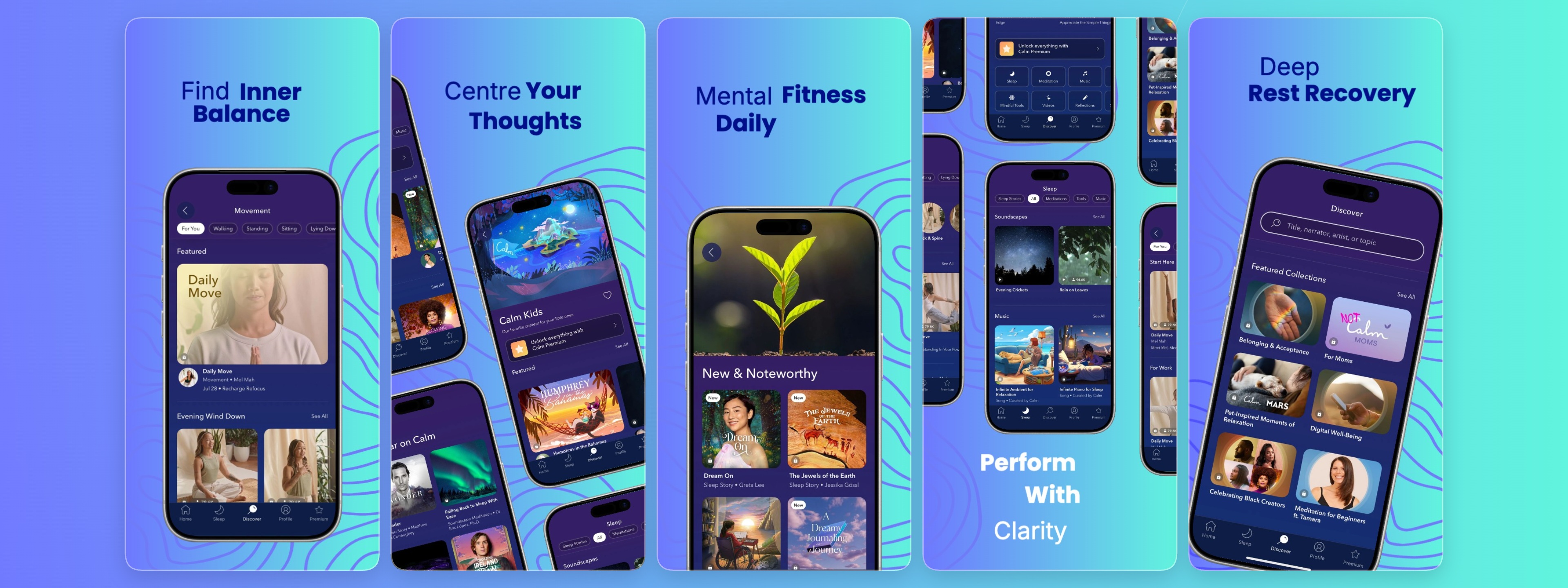
6. The Lifestyle Context Shot
Show your app in a real-world setting — someone planning a trip, tracking a workout, or ordering food. This helps users imagine themselves using it. Abstract UI screenshots don't sell apps; context does.
Best for: Lifestyle, social, travel, and food apps.
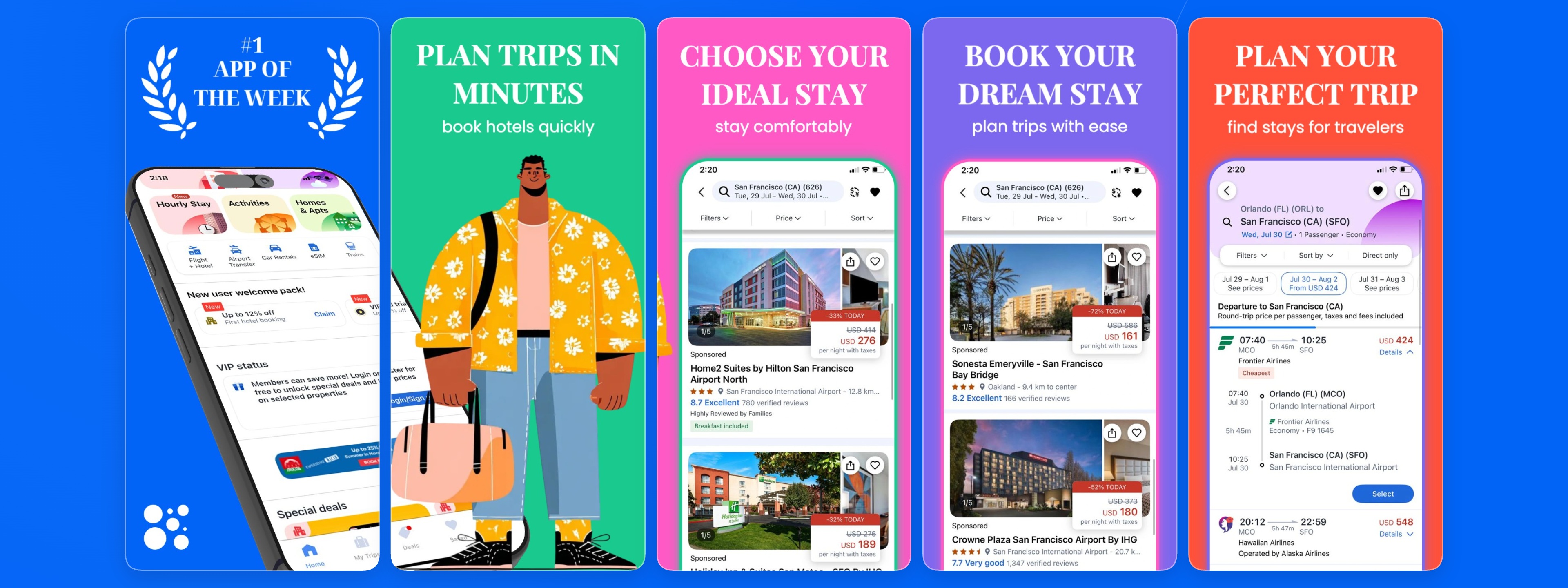
Example: a trip planner template that places the app UI inside a rich travel context, communicating the experience rather than just the features. Use this template →
7. The Dark Mode Showcase
A sleek, dark-themed screenshot set. Dark mode is visually distinctive in a sea of white-background screenshots and signals premium quality. Dark screenshots also tend to stand out in App Store search results where most competitors default to light themes.
Best for: Any app that wants to look premium, modern, or technical.
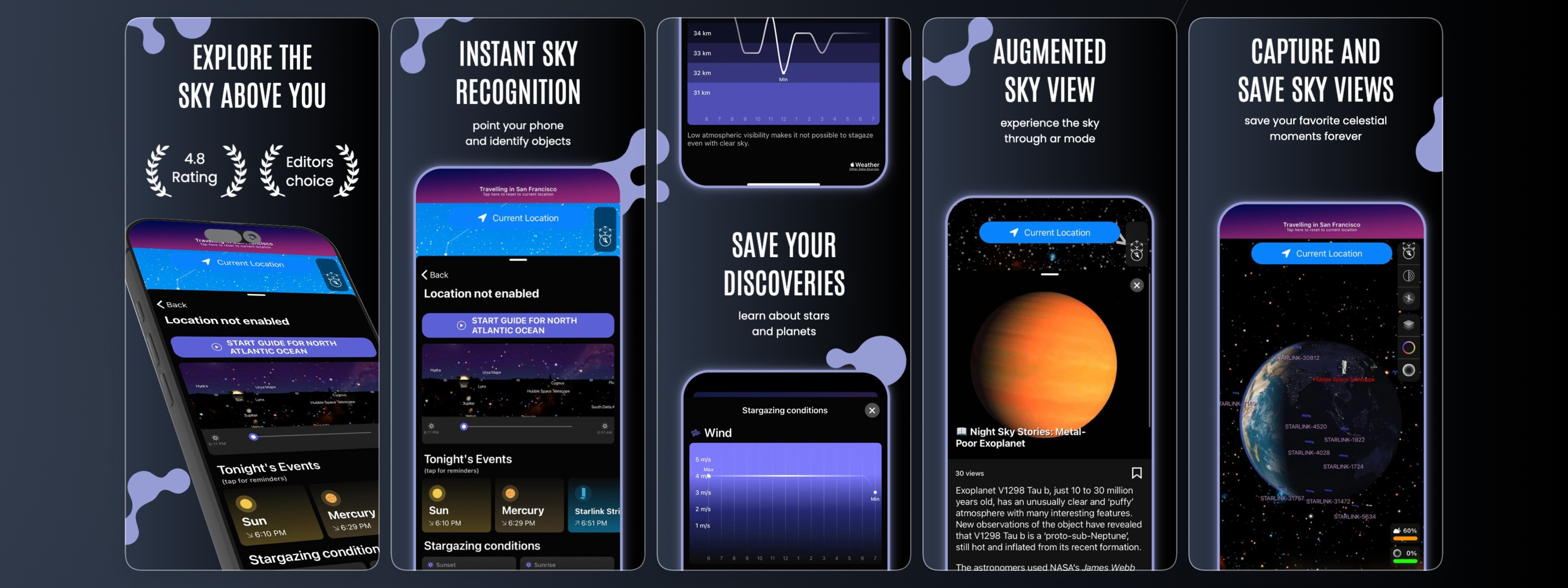
Example: a dark-mode star gazing template that uses deep backgrounds and vibrant accent colors to stand out in search results. Use this template →
8. The Step-by-Step Flow
Screenshots one through three show the core user journey: onboarding, main action, result. This tells a story and reduces the uncertainty that stops people from downloading. Users feel confident they know what they're getting before they commit.
Best for: Complex apps that need explanation, habit and productivity apps.
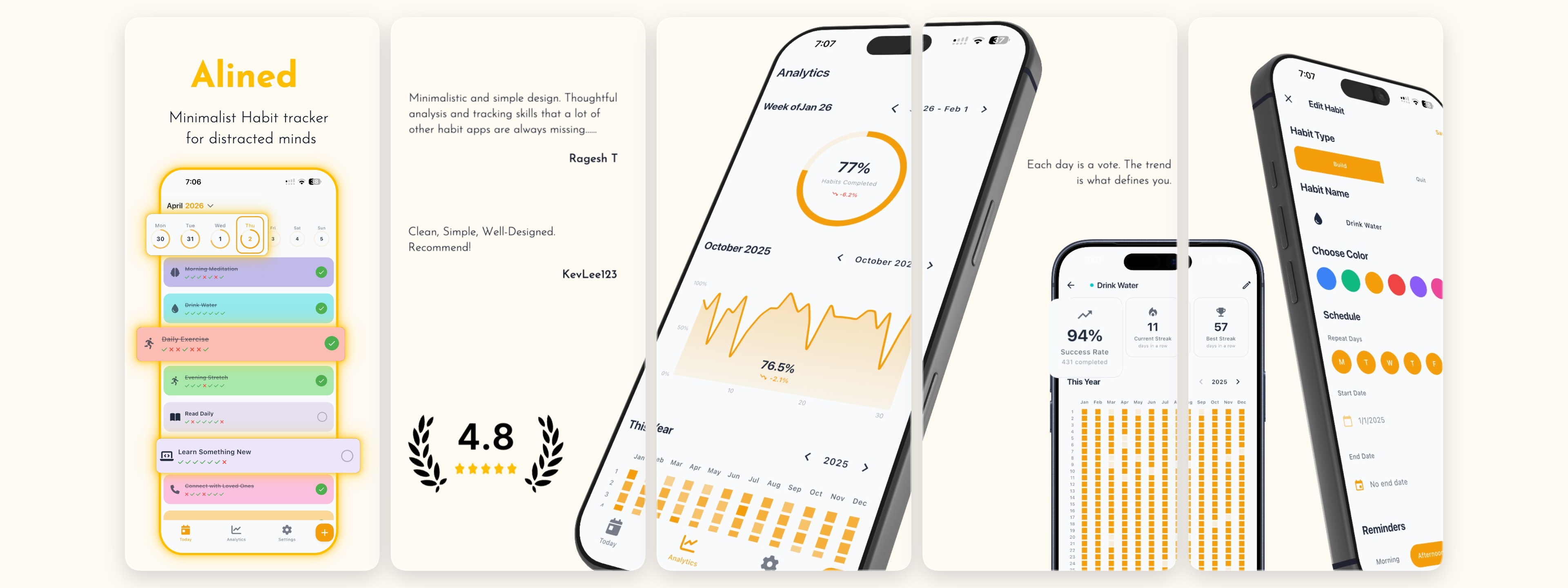
Example: a habits tracker template that walks users through the core flow — set a habit, track progress, celebrate streaks. Use this template →
9. The Comparison Table
Pit your app against competitors (tastefully). Highlight where you win on features, pricing, or ease of use. This works best when you have a clear, defensible advantage — a missing feature in competing apps, a significantly lower price, or a superior UX.
Best for: Apps in competitive categories like to-do lists, VPNs, or notes apps.
10. The Minimalist Single-Feature Focus
One clear headline. One mockup. One strong color. This bold approach cuts through noise and works surprisingly well for apps with a clear, singular value proposition. Less is more — don't try to explain everything in one frame.
Best for: Simple, elegant apps with a focused use case.
Example: a clean, minimal template that lets the UI speak for itself — no clutter, maximum clarity. Use this template →
Best Practices for High-Converting Screenshots
Lead with Your Value Proposition
Your first screenshot should immediately communicate what your app does and why it's valuable. Don't make users guess — show them the core benefit within the first frame. This is not the place for abstract branding or splash screens. Ask yourself: if this were the only screenshot a user saw, would they understand what my app does?
Use Real Device Frames for Context
Real device frames (iPhone, iPad, Android) help users visualize how your app will look on their device. They add professionalism and context that plain screenshots lack. Make sure frames are current models — using an iPhone 8 frame in 2025 signals outdated design and can undermine trust.
Optimize for Both Browsing and Tapping
Most users browse the App Store on mobile. Your text must be readable at thumbnail size — at least 30pt equivalent in the final export. Zoom out to 25% in your design tool and verify everything is legible. If a headline is hard to read at that size, it will be invisible in search results.
Localize for Global Reach
If you're targeting international markets, localize your screenshots. Translate text overlays, adapt cultural references, and consider right-to-left (RTL) layouts for Arabic and Hebrew markets. AI-powered localization tools can automate the bulk of this work while preserving your design system.
Maintain Visual Consistency
Use a consistent color palette, typography, and layout structure across all screenshots. This builds brand recognition and looks more professional. Inconsistent screenshots signal a lack of attention to detail — which users will subconsciously associate with a buggy or unreliable app.
Use Captions Strategically
Every screenshot should have a short caption that reinforces the visual. Use active voice: "Track every habit" rather than "Habit tracking." Pair benefit-driven captions with supporting UI that shows that benefit in action.
Common Screenshot Mistakes That Kill Conversions
Even well-designed apps often lose downloads due to avoidable screenshot errors:
Showing too much UI at once. Cluttered screenshots overwhelm users. Crop tightly to the most important part of your interface and remove unnecessary chrome.
Using placeholder or test data. Screenshots with "Lorem ipsum" text, empty states, or unrealistic numbers look unpolished. Use realistic, aspirational data that shows your app at its best.
Ignoring the first screenshot's impact. The first screenshot carries disproportionate weight. In App Store search results, only the first one or two screenshots are visible before users tap through. Treat the first screenshot as your primary advertisement.
Mismatched aspect ratios. Submitting screenshots at incorrect sizes causes cropping, distortion, or rejection. Always verify your exports against current Apple and Google requirements before submitting.
Not testing on real devices. What looks great on your design canvas may look different on an actual phone. Always preview your final screenshots on a real device or in a simulator before submitting.
Forgetting the App Store preview video. A short (15–30 second) App Store preview video can increase conversions by an additional 20–35%. If you have the resources, prioritize video alongside your screenshot set.
AI Localization: A Competitive Advantage
Reaching global audiences means speaking their language — literally and culturally. For app developers, this traditionally meant hiring translators, redesigning screenshots for each locale, and managing dozens of asset variations. AI localization is changing that calculus.
The Manual Approach
Before AI tools, localizing App Store screenshots meant:
- Translating text overlays manually for each target language
- Adjusting layouts for different text lengths (German text runs ~30% longer than English)
- Recreating screenshots in 10+ languages from scratch
- Managing hundreds of image assets across multiple export sizes
This process could take days or even weeks for a single app update — and had to be repeated every time you changed your messaging.
The AI-Powered Workflow
Modern AI localization tools can auto-translate text overlays while preserving fonts, colors, and positioning, adapt layouts for RTL languages like Arabic and Hebrew, generate locale-specific content that resonates culturally, and bulk-export all localized variants in one click.
Example: a wellness and mindfulness template with a clean, localization-ready layout — short text, ample negative space, and modular design that adapts well to any language. Use this template →
High-Impact Languages for App Store Localization
Based on App Store data, these locales consistently drive the highest download volumes:
| Rank | Language | Market Potential | Localization Priority |
|---|---|---|---|
| 1 | English (US, UK, AU, CA) | Highest | Essential |
| 2 | Spanish (ES, MX, LATAM) | Very High | High |
| 3 | German | High | High |
| 4 | French | High | High |
| 5 | Japanese | High | Medium |
| 6 | Korean | High | Medium |
| 7 | Portuguese (BR) | Medium-High | Medium |
| 8 | Chinese (Simplified) | Very High | High |
Even partial localization — translating just your first two screenshots into Spanish and German — can lift installs from those regions by 30–50%.
Testing and Optimization
A/B Testing Your Screenshot Sets
Always A/B test your screenshot sets. The App Store and Google Play both support store listing experiments. Run tests for at least two weeks to get statistically significant results. Test one variable at a time — either the order of screenshots or the design of a single frame. Testing both simultaneously makes it impossible to attribute results.
What to test:
- First screenshot (the most impactful variable)
- Light vs. dark color themes
- Text-heavy vs. visual-first layouts
- Screenshot order (does your social proof shot work better first or third?)
- Localized vs. English-only screenshots in international markets
Key Metrics to Track
- Conversion rate (impressions → downloads): The primary measure of screenshot effectiveness
- Tap-through rate on each screenshot position: Which frames users swipe to — low engagement on frame 3 suggests frames 1–2 aren't compelling enough to drive curiosity
- Retention correlation by screenshot variant: Downloads from well-aligned screenshots tend to have higher Day 1 and Day 7 retention
- Locale-specific conversion deltas: Track whether localized screenshots outperform English originals market by market
Iterating Based on Data
Don't treat screenshots as a one-time task. Top-performing apps on the App Store update their screenshots 3–4 times per year — aligning with new features, seasonal moments, and new competitive information. Build a screenshot review into your regular app update cycle.
Tools and Workflows
Instead of designing screenshots from scratch in Figma or Photoshop, consider using a dedicated screenshot generator. The right tool offers:
- Pre-built templates for different app categories
- Drag-and-drop editing with real device frames
- Built-in libraries of iPhone, iPad, and Android mockups
- One-click export for multiple resolutions
- AI-powered localization support
- Version control and team collaboration
StoreShots provides all of these in one tool, with a template library built specifically for App Store and Google Play. Browse the templates gallery to find a starting point for your app's category — or start from scratch with the editor.
Frequently Asked Questions
How many screenshots should I submit to the App Store?
Apple allows 3–10 screenshots per device size per localization. We recommend submitting at least 5 to tell a complete story, but avoid padding with weak frames — every screenshot should earn its place.
Do App Store screenshots need to show the actual app?
Apple's guidelines require that screenshots accurately represent the app experience. You can add marketing text, device frames, and background graphics, but the core UI shown must match what users will actually see when they open the app.
What's the difference between App Store screenshots and Google Play screenshots?
The main functional difference is that Google Play displays screenshots horizontally in a scrollable strip, while the iOS App Store shows them in a swipeable carousel. This affects framing: Google Play often benefits from landscape-oriented or wide screenshots, while portrait layouts work best on iOS. Google Play also shows screenshots directly in search results before users tap through to the listing.
How often should I update my App Store screenshots?
At minimum, update screenshots whenever you ship a significant new feature, rebrand, or notice a sustained drop in conversion rate. Top publishers update screenshots 3–4 times per year. Use App Store Connect's experiment feature to test new variants without fully committing.
Can I use the same screenshots for iOS and Android?
You can reuse the same design, but you'll need to export at the correct dimensions for each platform. Google Play requires different aspect ratios than the iOS App Store, so budget time to resize and verify each export. Device frames should also match the platform — show iPhone frames for iOS listings and Android frames for Google Play.
Do screenshots affect App Store rankings?
Screenshots don't directly affect keyword rankings, but they strongly influence conversion rate — which does factor into App Store algorithm signals. A higher conversion rate tells Apple that your listing is relevant and compelling, which can indirectly boost ranking over time.
Conclusion
Creating great App Store screenshots doesn't require a design team or a large budget. With the right templates, a clear understanding of ASO best practices, and modern localization tools, you can produce professional, high-converting visuals in under an hour.
The best template is the one that resonates with your specific audience. Start with these proven formats, then iterate based on your conversion data. Remember: what works on iOS may not work on Android — test on both platforms separately, and never stop optimizing.
Ready to get started? Browse our templates gallery and create your first screenshot set today.